Data or Art
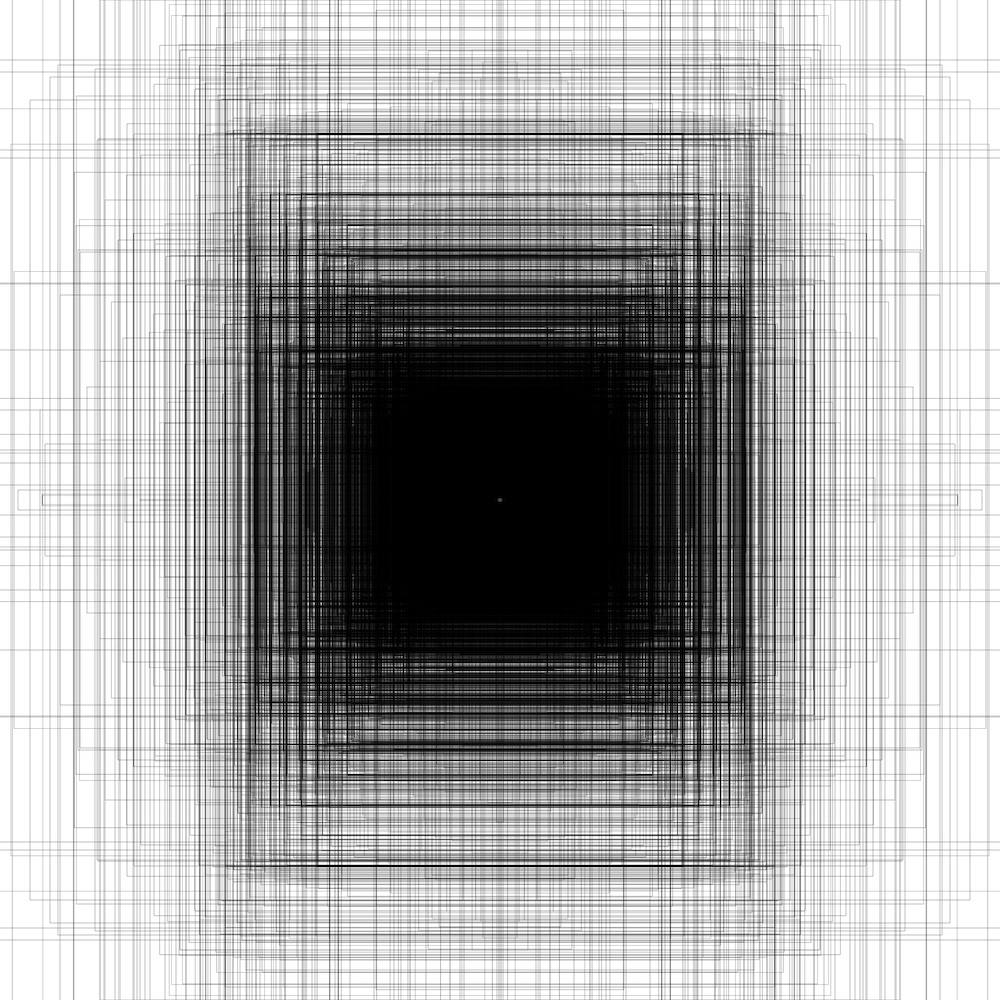
Here’s a fun quiz: can you tell the difference between 4 pieces of art and 4 pieces of data visualization?
Of course I’m being selective and picking pieces that are intentionally difficult, but my hope is to promote the idea that it’s worth our time as scientists to make our data visualization and presentation more attractive. Drawing in the viewer is a key step in communicating your ideas, especially when they’re subtle and technical!
The biggest lesson I got in this was from a blog post a few years back, visualizing the metadata from 65k pieces held in the Tate Modern art gallery. My original graph was fascinating, and a flop - nobody on social media seemed to care about it! My recreation did much better, despite it being a “worse” graph - it was itself art!
Check out this story, and my Data vs Art quiz in this short video!
It means a LOT to me if you subscribe to my YouTube channel!